Bollroc
Visual identity for a tunnel engineering consultancy operating in a field where credibility is often communicated through repetition of familiar industrial tropes
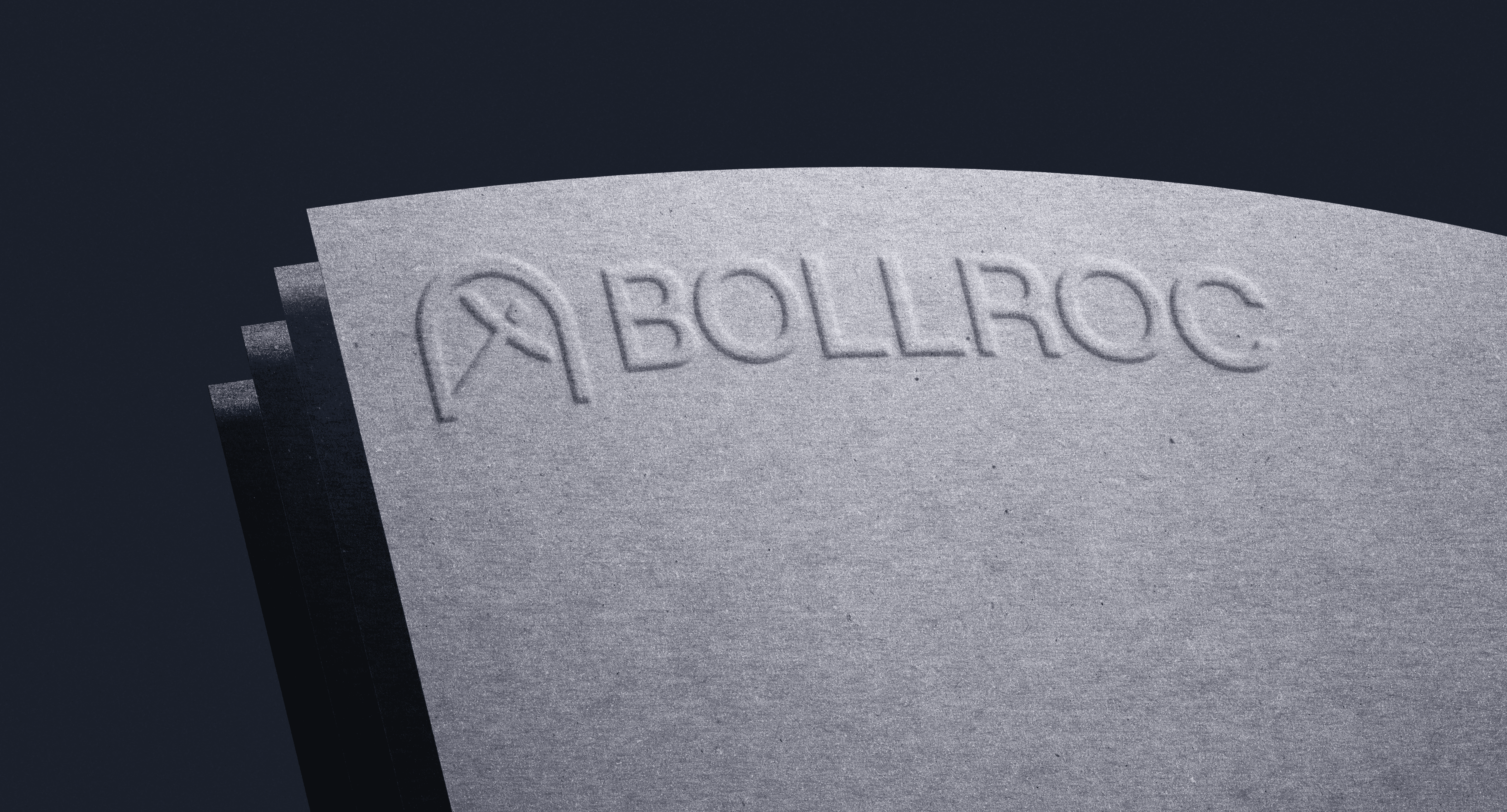
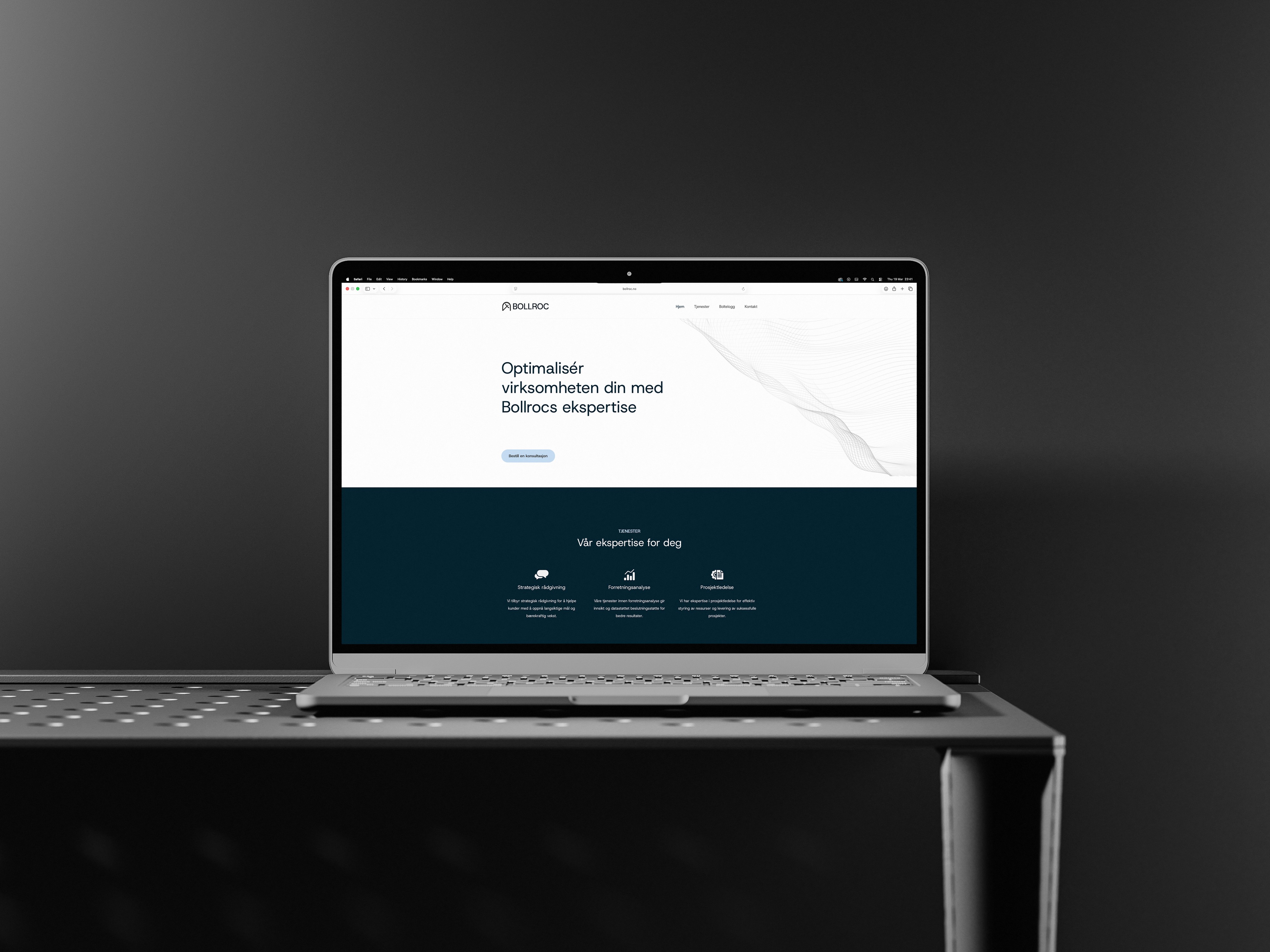
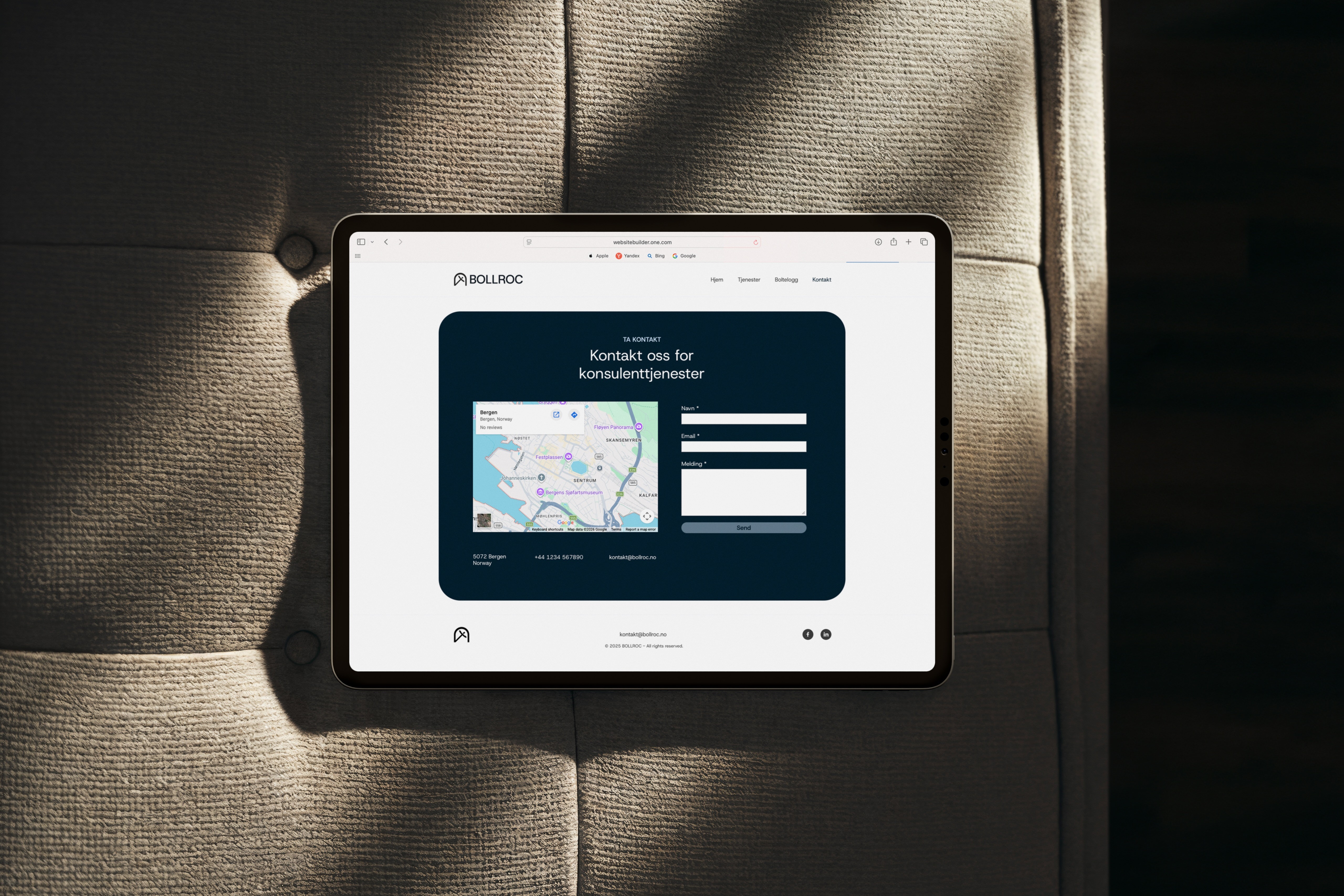
The brief called for a system that could distinguish the firm from bigger competitors without relying on decorative signals or overstated technical imagery. The work is built around a single structural mark that combines the silhouette of a tunnel arch with the logic of a bolt head, forming a compact symbol that carries both constructional and infrastructural reference. The identity extends into a restrained typographic and layout system designed for documentation, reporting, and digital interfaces, prioritising legibility and operational consistency across contexts.
The final system establishes a coherent visual language that aligns technical precision with practical usability across documentation-heavy environments.